ShaunSocial user guide 1.5.6 / AdminCP
Appearance
How your site looks: its colours (themes), light or dark mode for new members, which blocks appear on each page (layout editor), what visitors see before they sign in, the menus, your own pages such as Terms of Service, and the few things that are changed in files instead of in the AdminCP (your own styles and the browser icon). Logos and the share image are uploaded in Site Images.
Themes#
Last updated: 2026-11-17 · v1.5.6
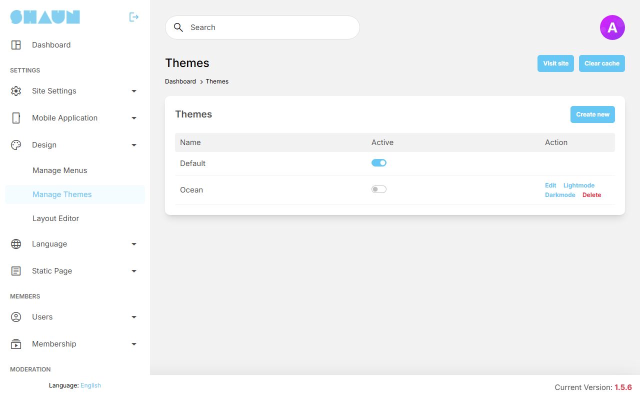
A theme is a set of colours for your whole site: one set for light mode and one for dark mode. The list shows each theme's Name, an Active switch and its actions. Exactly one theme is active at a time; members and visitors see the colours of the active theme.
After installing there is one theme, Default. It uses ShaunSocial's built-in colours and cannot be edited or deleted, so it has no actions in the list. To use your own colours, create a theme of your own.
Version 1.5.6 brought a new colour palette. If you upgraded from an older version, check your own themes as described in Step 3: after the upgrade.
Create your own theme#
- Open AdminCP → Design → Manage Themes and click Create new.
- Enter a Name (only you see it) and click Submit.
What you should see: "Theme has been created." and the new theme in the list, with the links Edit, Lightmode, Darkmode and Delete. It starts with the same colours as Default.
- Change its colours as described in the next section.
- Turn on its Active switch.
What you should see: the switch of the theme that was active before turns off. Reload your site: it shows the colours of your theme.
To go back to the built-in colours, turn on the Active switch of Default. You cannot simply turn the active theme's switch off: turn on the theme you want instead. Edit changes only the name. Delete is offered only for a theme that is not active.
Change the colours#
- Click Lightmode next to your theme for the colours of light mode, or Darkmode for the colours
members see in dark mode.
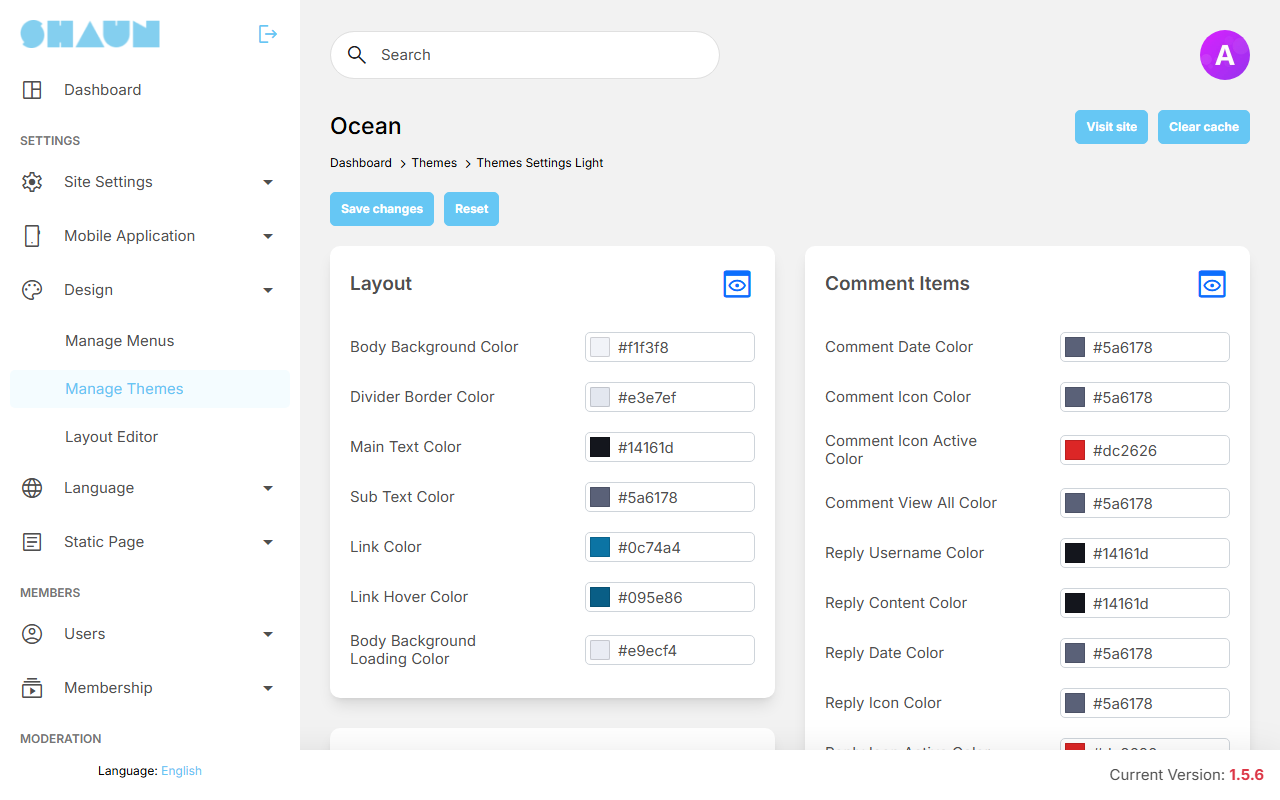
What you should see: the colours grouped in boxes by the part of the site they colour.
- Click a colour field to pick a colour, or type it (for example
#2f6fde). The slider in the picker sets how see-through the colour is. - Click Save changes at the top.
What you should see: "Theme settings have been successfully saved." If the theme is active, members see the new colours on their next page load.
The boxes, in the order of the screen, are: Layout, Widget, Header, Footer, Main Content, List Items, Grid Items, Emoji Picker, Mobile, Modal, Profile, Global Search, Story, Notification, Post Status, More, Sidebar, Comment Items, Feed Items, Form, Chat, Cookies Warning, Mention Box, Fetched Link, Video Player, Vibb, Tabs Menu, Invites and Badges. Each colour has a label such as Link Hover Color; the preview below shows exactly where it is used.
Reset (next to Save changes) puts every colour of the mode you are editing back to the built-in value, after you confirm "Do you want to reset this theme?". The other mode is not changed.
Preview where a colour is used#
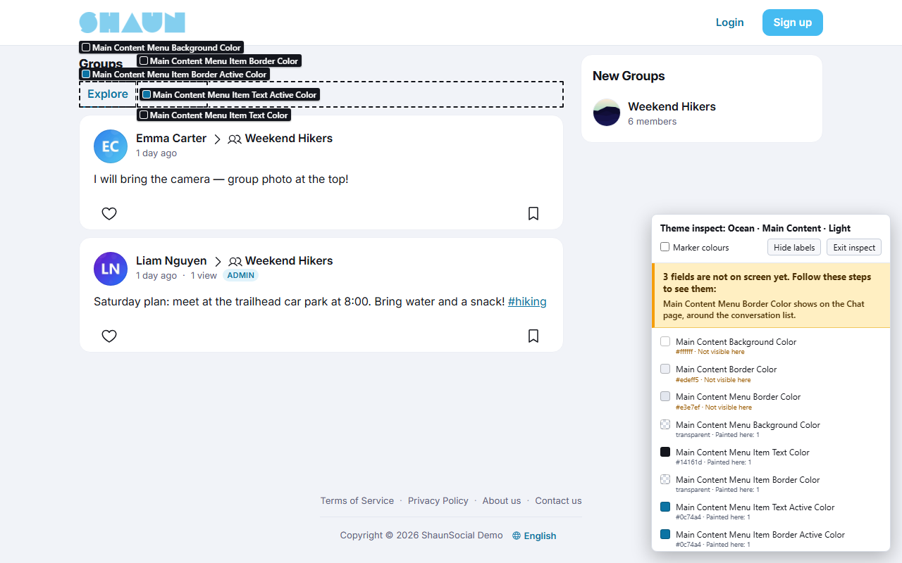
Each box has a preview button in its top right corner (Preview on the site). It opens your site in a new tab with the colours that are in the form right now, saved or not, and puts a small label on everything the box's colours paint. Only you see this preview; your members keep seeing the saved colours.
- The heading of the panel names the theme, the box and the mode: Light when you opened the preview from Lightmode, Dark when you opened it from Darkmode. To preview the other mode, open the preview from that screen.
- The panel lists every colour of the box. A colour marked Not visible here is used somewhere you have not opened yet; the panel says how to make it appear (for example: open the composer, or hover a link).
- Marker colours paints every colour of the box in a bright colour of its own, so you can tell them apart.
- Hide labels hides the labels; Exit inspect ends the preview.
The preview changes nothing. Go back to the AdminCP tab and click Save changes to keep the colours.
Default light / dark mode#
Last updated: 2026-11-17 · v1.5.6
Every member chooses between light mode, dark mode, or System (follow the setting of their phone or computer). The setting User's default appearance mode after sign up decides what a new account starts with:
| Choice | New members start in |
|---|---|
| Light (chosen after installing) | light mode |
| Dark | dark mode |
| System | the mode their device is set to |
- It applies to accounts created after the change. Existing members keep the mode they have.
- Visitors who are not signed in see the mode their device is set to.
- Like every setting on this screen, it is saved as soon as you click a choice (see Settings save themselves).
What members see#
Members change their own mode with the Appearance button in the header (choices Light, Dark and System) or in Settings → Display. Dark mode uses the Darkmode colours of the active theme.
Layout editor#
Last updated: 2026-11-17 · v1.5.6
Most pages of your site are built from blocks (also called widgets): the page's own content in the middle, and blocks such as Suggested Users Block or Trending Hashtags Block around it. The layout editor decides which blocks each page shows, where, and to whom.
What the screen shows#
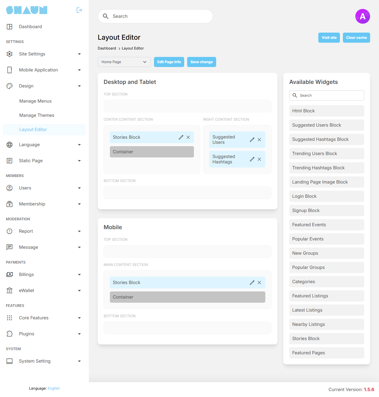
- At the top: the page you are editing (a list), Edit Page Info and Save change.
- On the left, two layouts of the page: Desktop and Tablet, and Mobile (phones). Each has a Top Section, a Center Content Section (on Mobile: Main Content Section), a Right Content Section (not on Mobile) and a Bottom Section. The two layouts are set up separately: a block you add to Desktop does not appear on phones until you add it to Mobile too.
- On the right: Available Widgets, with a Search box.
The page's own content (for example the home feed or a profile) is a fixed box: it has no edit or remove button and cannot be removed. The blocks around it can.
The pages#
After installing, the list holds: Header & Footer, Default Landing Page, Custom Landing Page, Home Page, Explore Page, Discover Page, User Profile Page, Post Detail Page, Watch Page, Bookmark Page, Media Page, Documents Page, Events, Event Detail Page, Groups, Group Profile Page, Marketplace Page, Listings Page, Listing Detail, Pages, and one entry per static page (Terms of Service, Privacy Policy, About us and the pages you create, see Static pages). Plugins can add pages of their own.
Header & Footer is different: it has only a Header Section and a Footer Section around the content area, and accepts only Html Block. What you put there appears above or below the content of every page signed-in members see, for example an announcement bar.
The blocks you can add#
| Block | What it shows | Its own setting |
|---|---|---|
| Html Block | your own text, images or code | Content |
| Suggested Users Block, Trending Users Block | members to follow | Number of items to show |
| Suggested Hashtags Block, Trending Hashtags Block | hashtags | Number of items to show |
| Landing Page Image Block | a large picture or video, for the landing page | Image/Video (a photo or an MP4 video) |
| Login Block, Signup Block | the sign-in form, the sign-up form | none |
| Stories Block | the row of stories | none |
| New Groups, Popular Groups | groups | Number of items to show |
| Featured Events, Popular Events | events | none |
| Categories, Featured Listings, Latest Listings, Nearby Listings | Marketplace categories and listings | Number of items to show (not for Categories) |
| Featured Pages | featured business pages | Number of items to show |
Blocks of a plugin that is switched off are not offered.
Add, change and remove blocks#
- Choose the page in the list at the top.
- Drag a block from Available Widgets into a section of the Desktop and Tablet or the
Mobile layout.
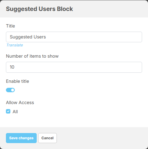
What you should see: a window with the block's settings:
- Title: the heading of the block. Other languages can be added after the block is saved.
- the block's own setting from the table above, if it has one;
- Enable title: show the title above the block;
- Allow Access: who sees the block. All, or only the roles you tick (Guest is a visitor who is not signed in).
- Fill them in and click Save changes in that window.
- Drag blocks up and down to change their order. Click the pencil of a block to change its settings, or its
×to remove it. - Click Save change at the top of the screen.
What you should see: "Layout has been successfully updated." Nothing is stored until you click it: leaving the screen before that loses your changes.
The title of a block that is already saved cannot be typed over in its window; click Translate under it to change the title in each language (see Translate a name or text). The same applies to the content of an Html Block.
Page title and search engine text#
Edit Page Info opens the page's Name (change it in each language with Translate), Meta keywords and Meta description: the text search engines show for that page. Click Submit; you see "Page info has been successfully updated."
Landing page types#
Last updated: 2026-11-17 · v1.5.6
The landing page is what people who are not signed in see on your home page. The three choices are described in Landing page; this section explains how to change what each one shows. Members who are signed in always see their home feed instead.
| Choice | Where you change its content |
|---|---|
| Default landing page | Layout editor, page Default Landing Page. After installing it holds a Landing Page Image Block and a Login Block on computers, and the Login Block on phones |
| Custom landing page | Layout editor, page Custom Landing Page. The public posts of your community are its fixed content; add blocks around them |
| Designed landing page (after installing) | Not in the layout editor. Its texts are phrases of your language, changed in Edit phrase; it uses your Site title, logo and app links from Site Information |
Change the picture of the default landing page#
- Open AdminCP → Design → Layout Editor and choose Default Landing Page.
- Click the pencil of Landing Page Image Block in the Desktop and Tablet layout.
- Under Image/Video, choose a photo or an MP4 video. It is uploaded at once and a small preview appears.
- Click Save changes in the window, then Save change at the top of the screen.
- Open your site in a private browser window to see it as a visitor.
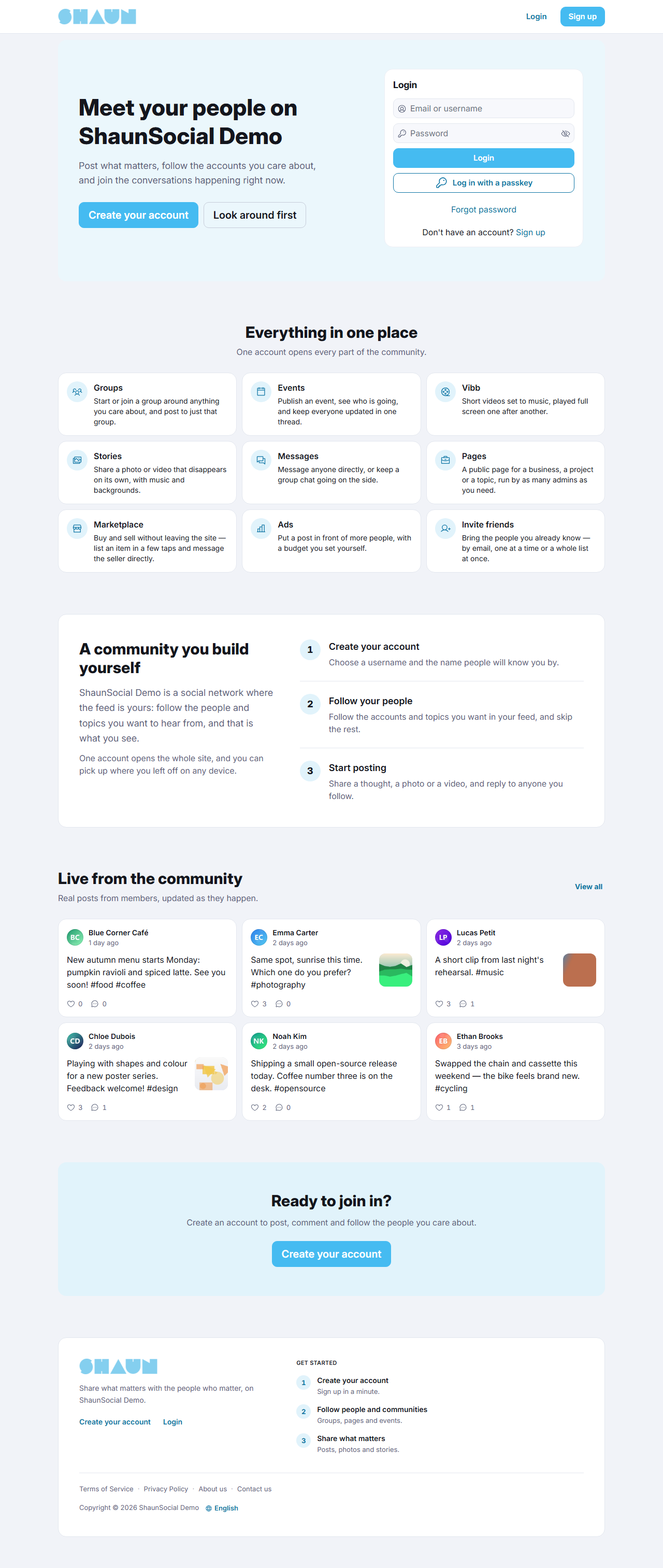
What the designed landing page shows#
A welcome banner with Create your account, Look around first (it opens the public posts; not shown while Force Login is on) and, if you set up social login, its buttons; a short introduction; Live from the community with recent public posts; Everything in one place, a fixed list of ShaunSocial's main features (it does not change when you switch a feature off); Check out our mobile apps! with your app links, shown only when an Android or iOS app link is enabled in Android & IOS Apps; and a footer with Login, Create your account, the links of the Footer Menu and the Language choice. Where sign-up is closed, the sign-up buttons are not shown.
Menus#
Last updated: 2026-11-17 · v1.5.6
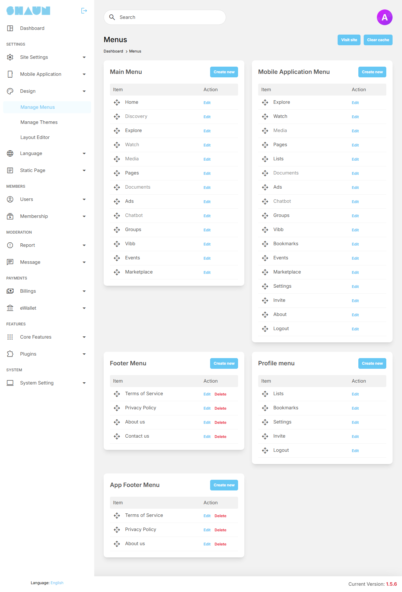
The screen shows the five menus of your site, each with its items and a Create new button:
| Menu | Where it shows | Icons, sub-items |
|---|---|---|
| Main Menu | the menu on the left side of the website (Home, Explore, Groups and so on) | yes, yes |
| Mobile Application Menu | the menu of the ShaunSocial mobile apps | yes, yes |
| Footer Menu | the footer of the website (Terms of Service, Privacy Policy, About us, Contact us) | no, no |
| Profile menu | under Profile Menu in the website's left side (Lists, Bookmarks, Settings, Invite, Logout) | yes, yes |
| App Footer Menu | the footer links of the mobile apps (Terms of Service, Privacy Policy, About us) | no, no |
An item shown in grey is switched off. Some items are switched off after installing (for example Discovery, Watch, Media and Documents in the Main Menu); edit them and tick Active to show them.
Add or change a menu item#
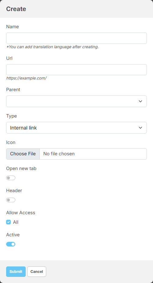
- Click Create new on the menu, or Edit next to an item.
- Fill in the fields:
Field What it does Name the text of the item (required). After saving, change it in each language with Translate Url required, except for a heading. With Internal link: the part of the address after your site address, for example sp/about-us(the full address is shown under the field). With Outbound link: a full address such ashttps://example.comParent put the item under another item (in menus with sub-items) Type Internal link (a page of your site) or Outbound link (another website) Icon an SVG file shown next to the name (in menus with icons) Open new tab open the link in a new browser tab (not in the Mobile Application Menu) Header only in menus with sub-items: make the item a heading without a link, to group sub-items under it. Url, Parent, Type and Open new tab then disappear Allow Access All, or only the roles you tick. Untick Guest to hide the item from visitors who are not signed in Active show the item. Leave it off while you prepare an item - Click Submit.
What you should see: the list again, with your item. Open your site to check it.
- Order: drag an item by the move handle at its left. The new order is saved as soon as you drop it.
- Built-in items of the Main Menu, the Mobile Application Menu and the Profile menu (Home, Explore, Settings, Logout and the other items ShaunSocial and its features add) have no Delete link and their address cannot be changed. Switch them off with Active, or limit them with Allow Access. The items of the Footer Menu and the App Footer Menu can be changed and deleted like your own.
- Delete removes the item, after you confirm. If it was a heading, the items under it that can be deleted are deleted with it; built-in items under it move to the top level.
Static pages#
Last updated: 2026-11-17 · v1.5.6
Static pages are pages of text you write yourself: your terms, your privacy policy, an about page, a help page.
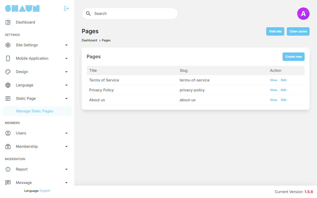
Each one has the address https://example.com/sp/<slug>. After installing there are three, linked
in the footer menu: Terms of Service (terms-of-service), Privacy Policy
(privacy-policy) and About us (about-us). They hold one line of sample text ("This is the Terms of Service page" and so on): replace it
with your own before you open your site.
The list shows each page's Title and Slug, with View (opens the page on your site), Edit and, for pages you created, Delete. The three built-in pages cannot be deleted.
Create or edit a page#
- Click Create new, or Edit next to a page.
- Fill in the fields:
Field What it does Language only when editing: the language whose title and text you are changing. Choosing another language reloads the form with that language's text Title the page heading (required, up to 255 characters) Slug the end of the page address (required): letters, numbers, dashes and underscores only, and different from every other page. The full address is shown under the field Content the text, in an editor with styles, bold, lists, colours, links and images Meta keywords, Meta description the text search engines show for the page (up to 255 characters each) Allow Access All, or only the roles you tick. Keep Guest ticked for pages visitors must be able to read, such as your terms - Click Submit.
What you should see: "Page has been created." (or "Page has been successfully updated.") and the list. Click View to check the page.
If your site has several languages: a new page starts with the same title and text in every language. Edit it, choose each language in Language, translate the title and text, and click Submit once per language.
Link a page from a menu#
A new page is not linked anywhere yet. Add it to a menu (see Add or change a menu item):
choose Internal link and enter sp/ followed by the slug, for example sp/help. To show
blocks next to the page's text, choose the page by its title in the Layout editor.
Custom CSS#
Last updated: 2026-11-17 · v1.5.6
Themes change colours. To change anything else about the look (a font size, a margin, hiding an element) you can add your own CSS, the language web pages use for their style. There are two places for it; both apply to the member side of your site, not to the AdminCP.
In the AdminCP (recommended)
AdminCP → Site Settings → Site Information → Head Scripts/Styles (see
Website Settings). Put your rules between
<style> and </style>. Kept by every upgrade, and applied after the theme
colours, so your rules win.
In a file
The file public/css/custom.css of your site, empty after installing, edited with your host's file
manager or FTP. Replaced by an empty file at every upgrade: keep a copy (see
Keeping your customisations).
For example, to make the text of posts and comments a little larger:
<style>
.markdown-content { font-size: 1.05rem; }
</style>
Members see the change on their next page load; press Ctrl+F5 to see it yourself at once. CSS that targets the inner structure of pages can stop working after an upgrade if that structure changes; check your rules after each upgrade.
Favicon#
Last updated: 2026-11-17 · v1.5.6
The favicon is the small icon in the browser tab and in bookmarks. There is no AdminCP setting for it: you replace
files in the public folder of your site with your host's file manager or FTP.
| File | Where it shows |
|---|---|
public/favicon.ico | the browser tab and bookmarks |
public/images/manifest/72x72.png, 96x96.png, 128x128.png,
192x192.png, 384x384.png, 512x512.png | the icon on a phone's home screen
when someone adds your site to it (the 192x192.png one also on iPhones) |
- Make your icon in these sizes; a free online favicon generator can make the
.icofile and the PNG sizes from one picture. Keep the file names exactly as above. - Upload the files over the existing ones.
- Open your site and press Ctrl+F5.
What you should see: your icon in the browser tab. Browsers keep old icons for a while; if you still see the old one, open the site in a private window. Search engines can take days to show the new icon.
An upgrade replaces these files with ShaunSocial's own. Keep your icons and upload them again after each upgrade (see Keeping your customisations).
The Icon of the browser notifications is a separate setting, in Progressive web app.
Change log#
Last updated: 2026-11-17 · v1.5.6
| Date (GMT+7) | Section | What changed |
|---|---|---|
| 2026-11-17 | themes, landing-page, menus | Corrections after review: the panel of the colour preview, the buttons and links of the designed landing page, when Header and Url apply, which menu items can be deleted. |
| 2026-11-17 | all | First version for 1.5.6, written from the 1.5.6 code. The lists of layout pages, blocks and menu items were checked against a freshly installed demo site; the colour preview and the favicon steps were read from the code, not run. |